• Design + Research
  • Education
  • Publications
  • Blog
  • About
  • Contact
Menu

Jamie Steane

  • Design + Research
  • Education
  • Publications
  • Blog
  • About
  • Contact

Bigg Ideas (2019)

As part of a £3.2 million regeneration scheme, this Heritage Lottery funded project aimed to engage people with the heritage of Newcastle’s historic ‘Bigg Market’ through activities, events and learning. Understanding their interest heritage and their motivation for learning was of importance for the researchers.

To achieve this, researchers worked with groups of students from Art and Design disciplines to explore the Bigg Market’s heritage through a series of open and set briefs. The final design concepts and artworks were then displayed in public exhibition.

Research aims:

To engage people with the heritage of Newcastle’s historic ‘Bigg Market’ through activities, events and learning.

To better understand the interest, value and motivations for engaging with heritage.

Context:

‘Giving historic heart back to Newcastle’ is a Townscape Heritage Initiative . THI’s are one of several focussed Heritage Lottery Funds. They aim to carry our improvements to heritage buildings in a focussed area of towns and cities.

In this case, the project in centred on the Bigg Market. It was run by NE1, the local business improvement district company. The project was part of NE1’s wider work to improve the Bigg Market and change the profile of people who go there, from a low yield, night time clientele to a higher budget, day and night audience.

Method:

Researchers worked with NE1’s consultants Bowles Green to explore a number of project ideas that would meet the Heritage Lottery Fund’s aspiration to engage people with heritage through activities, events and learning.

Researchers and NE1 staff worked with groups of students from Art and Design disciplines to explore the Bigg Market’s heritage through a series of open and set briefs. The final design concepts and artworks were then displayed in public exhibition.

The exhibition features work from first year Fashion Communication, Graphic Design and Interaction Design students as well as MFA Fine Art and final year Interaction Design students.

More than 200 students took part in the project with over 30 of the best final artworks, concepts and design prototypes on show in this exhibition.

Over 300 visitors came to see the exhibition which was open to the general public between 25th and 30th July 2019.

IMG_3257.jpg
IMG_3206.jpg
Baltic 39 NE1 (66 of 81).jpg
IMG_3220.jpg
Baltic 39 NE1 (70 of 81).jpg
Screenshot 2019-07-23 at 09.39.52.png
Screenshot 2019-07-23 at 09.40.23.png
IMG_3202.jpg
Baltic 39 NE1 (77 of 81).jpg
Baltic 39 NE1 (4 of 81).jpg
Baltic 39 NE1 (37 of 81).jpg
Baltic 39 NE1 (58 of 81).jpg
Baltic 39 NE1 (21 of 81).jpg

Tapestry (2017–2019)

TAPESTRY: Trust, Authentication and Privacy over a DeCentralised Social Registry is an EPSRC funded research project lead by Prof. John Collomose of the University of Surrey. Its aim is to investigate, develop and demonstrate transformational new technologies such as ‘Blockchain’ in order to enable people, businesses and digital services to connect safely online, 2017–2019.

Working closely with co-investigator Jo Briggs, myI role was to design UI concepts that could help users make more informed decision about who to trust based on data from other users’ social media histories.

Algorithms and software were developed to analyse users’ social media. It analysed the language they used and topics talked about to look for consistencies and importantly inconsistencies and recorded this in a blockchain. Anyone trying to fake their identity on social media would more than likely cause inconsistent or anomalous patterns in their TAPESTRY blockchain data.

From a design perspective, it was important that avoid traffic light or star ratings as this made value judgements about other users trustworthiness. Our data could only show the frequency of their social media use and whether their use was consistent or anomalous. We therefore develop numerous visual concepts that could reveal patterns. These concepts took the form of icons thats could be placed on a browser, embedded in a web page or in an app.

The three contexts we chose for testing were crowd funding, online dating and e-commerce.

Icon Concepts
Icon Concepts

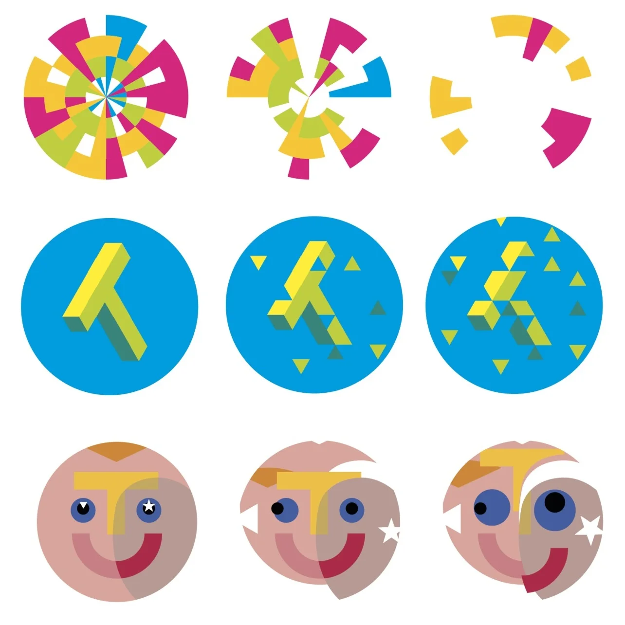
10 initial icon concepts were developed for feedback from the research team and potential used. Some were based on familiar information design concepts such as pie charts, some were more typographic using the ‘T’ shape to represent ‘TAPESTRY’ and others people’s faces.

Size Testing
Size Testing

The icons needed to be readable at very small sizes e.g browsers icons that were rolled over or click could reveal an extended panel or dashboard.

Control Panels
Control Panels

This ‘Pie Piece’ concept was a preferred concept.

New Concepts
New Concepts

More concepts were explored based on feedback and discussion by the team. Of the four new concepts ‘Slash’ was a preferred concept to progress.

Screenshot 2019-07-23 at 07.10.14.png
Control Panels
Control Panels
On Boarding
On Boarding

For user testing we developed a series on on boarding instructions for a variant of the pie pieces called ‘rings’

Interactive Prototypes

We prototyped wireframes for interactive user testing and to help build the final working prototypes.

Freeman Hospital

Freeman Hospital Digital Patient Information Resource (2019) for prospective Heart & Lung Transplant Patients. This project has now been developed into a full project proposal with work anticipated to begin in mid 2019. The proposed solution – an innovative web-based video-driven learning resource that helps patients better understand the transplant process.

This proposal for the redesign of the current Patient Information Pack is based on a research gathering exercise undertaken by Andy Frith and Jamie Steane from Northumbria University at the Freeman Hospital initially in 2014 and with a wider team again in 2019. The research included informal interviews with staff and patients, shadowing and evaluation of the current patient material available.

Illustrations by Andy Frith.

Scenario
Scenario

This is John, he is a 53 year old steel worker from Sheffield...

  John was mainly interested in what previous patients had to say about the operation, and what their lives had been like since. He was able to do this privately on his tablet device.

John was mainly interested in what previous patients had to say about the operation, and what their lives had been like since. He was able to do this privately on his tablet device.

  John's youngest daughter accesses transplant information via mobile.

John's youngest daughter accesses transplant information via mobile.

 John watches lots of different people who had experienced the operation, all of which gave a candid view on what it was like, the good points and the bad.

John watches lots of different people who had experienced the operation, all of which gave a candid view on what it was like, the good points and the bad.

  Johns watches informal videos with family using his smart TV.

Johns watches informal videos with family using his smart TV.

 John's lung transplant was a complete success. He now appears in a video on the 'Hub' telling HIS story, to help other patients in the future.

John's lung transplant was a complete success. He now appears in a video on the 'Hub' telling HIS story, to help other patients in the future.

W * * * C H C R A F T ! Conference

Overview

In 2018, I proposed the conference theme and lead the organisation of the Graphic Design Educators’ Annual Conference held at the School of Design at Northumbria University, Newcastle-upon-Tyne.

Conference Theme

By definition, craft describes both the act of making things by hand and the art of persuasion. This double meaning resonates with the discipline of Graphic Design, as so much of our practice is wrapped up in how and why we create communication.

New technology has certainly increased our craft and influence, often beguiling our users. However, its dark art also questions our magician’s status as artificial intelligence generates increasingly persuasive autonomous design. By contrast, the ubiquity of technology-driven solutions has also created a greater appetite for bespoke design crafted by the human hand.

Therefore as our field of expertise continues to evolve – fusing, multiplying, specialising – and the mystery and power of its application grows, deciding what to learn and how to study it is a prevalent question for both aspiring and established designers and educators.

From designer-makers to digital strategists let us share, explore and debate the w**chcraft inherent in the practice and education of contemporary graphic design.

Results

The conference was attended by almost 100 delegates many of whom were from leading UK institutions with representation from the Europe, US and Australia.

Branding
Branding

W * * C H C R A F T ? Exploring notions of craft within contemporary graphic design education.

Keynotes
Keynotes

Catherine Dixon gives keynote on ‘thinking-through-making’.

Workshops
Workshops

Roxanne Bottomley and Pushpi Bagchi take part in Chris Wilson’s letterpress workshop at Northumbria University

Workshop
Workshop

Digital Crafts – Jonathan Hamilton shares his VR project of a theatre designer’s studio.

Workshop
Workshop

Sebastian Bissinger and Laure Broer of Bank Associates lead their workshop on ‘Open Creativity’.

Discussion Papers
Discussion Papers

The conference was divided into Discover (Workshops), Discussion (Papers), Display Presentations and Debates.

Making Connections
Making Connections

A chance for educators and practitioners to meet and discuss our subject.

GDEN and Keynotes
GDEN and Keynotes

Graphic Design Educators’ Network Committee and Keynotes Joanna Choukeir and Catherine Dixon.

Graphic Design Educators' Network (2017)

This website was developed to support a newly formed educational networked based in the UK. The purpose of the website was to promote events and share news and educational practice. The website also features a members section for them to share research interests for collaboration and show availability for external examination. 

My role was to define the user experience, develop the wireframes and help establish the visual language. The website itself was developed using Wordpress by Oscar Chiu.

Visit the website: http://www.graphicdesigneducators.network/

Homepage
Homepage
gden-profiles.png
Wireframes
Wireframes

Working Carers

Working Carers was an E-Learning Project created for Gateshead Carers (2016/17). The primary aim of this pilot e-learning package was intended to demonstrate the business case for employers to support working carers through the provision of a free online e-learning resource that can be facilitator led or self-guided.

To create and deliver this project a novel multidisciplinary team of professional, graduate and undergraduate filmmakers, journalists and designers was assembled. My overarching roles were creative direction and project management, with some design lead work around branded elements.

http://www.workingcarersandemployers.co.uk/

E-Learning Website
E-Learning Website
Participatory workshops with stakeholders
Initial website design layouts
New identity concepts
Final logo design
Final logo design
Final web design
Final web design
Eddie's story...
Eddie's story...
Jack's story...
Jack's story...
Julia's story...
Julia's story...

See It All (2015)

‘See It All’ Smart Home Security System (2015). Global Safeguard asked us to research and design a proof of concept that include digital branding, promotional animation and app demo to attract investors and support a Horizon 2020 bid for disruptive innovation.

This research through design project also gave two graduate design researchers Yoori Lee and James Scott a great learning experience by work directly with local entrepreneur Glen Monaghan on a highly innovative project at the time.

The demonstration feature face recognition and pattern learning (a form of artificial intelligence) which were not commonly used in domestic consumer products in 2015.

Since then, we witnessed a number of widely televised smart security products enter the marketplace in the UK.

See It All Animation

Infomercial for the See It All concept.

Project Research
Project Research

Selected pages from the initial project research document.

Storyboard
Storyboard

A selection of keyframes from the original storyboard for the concept infomercial.

Identity
Identity

Different colour ways for the visual identity.

App Interface
App Interface

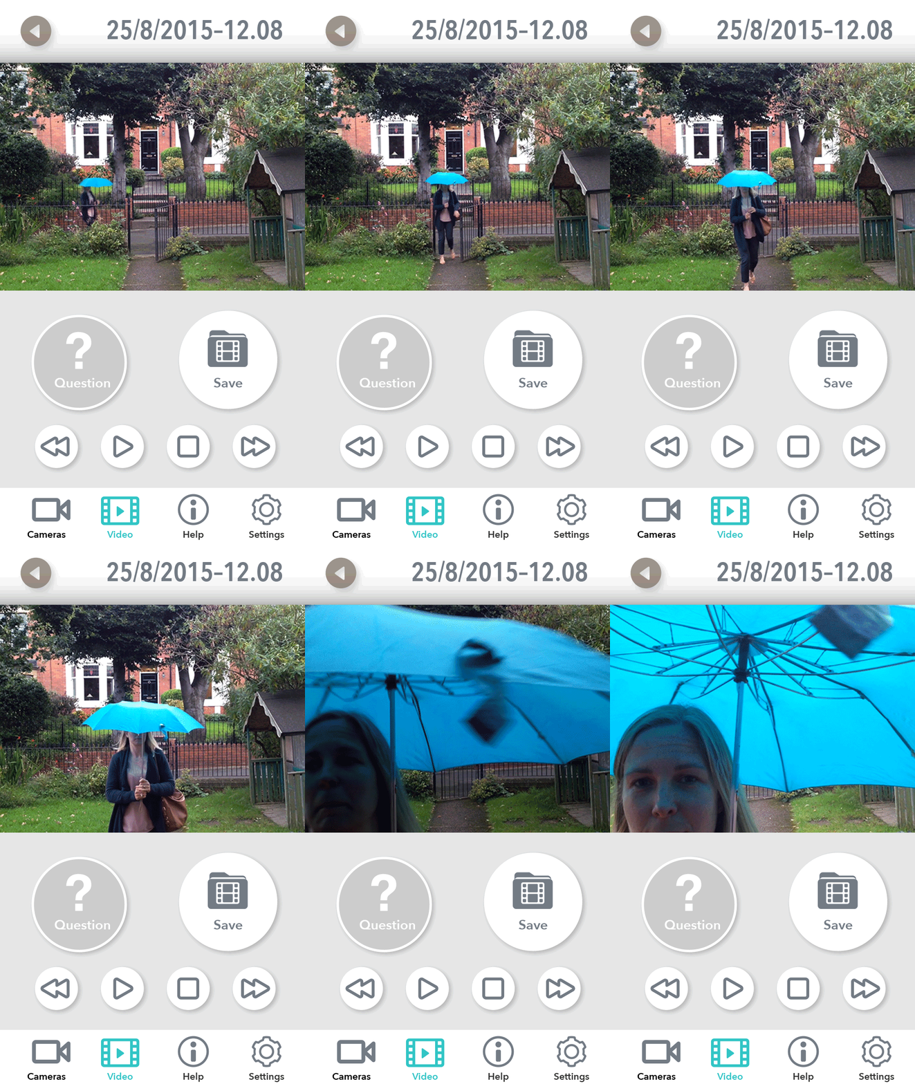
The app has face recognised a regular visitor - no user questions to answer for pattern learning.

Pattern learning
Pattern learning

Is this activity suspicious? The app has questions about this person and their behaviour…

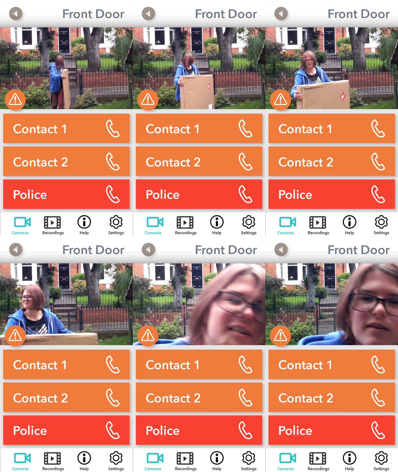
Contacting others
Contacting others

If the user is unsure whether they should answer the door or use the intercom feature, should they speak to someone on their emergency contact list for help or advice?

Ardugula

In late 2015 I was approached on behalf of an aboriginal charity 'Ardugula' in the Northern Territories, Australia to see if I could create a web and social media presence to help them raise awareness of their cause.

One of their  aims is to buy back aboriginal land, which they hope to achieve through donations.

After initial conversations, it seemed the most important first steps was to create an identity for them based on identifying their value proposition. This was an challenging piece of work to develop at geographic distance. Workshop activities were carried out remotely.

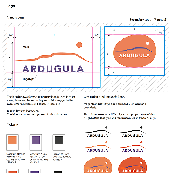
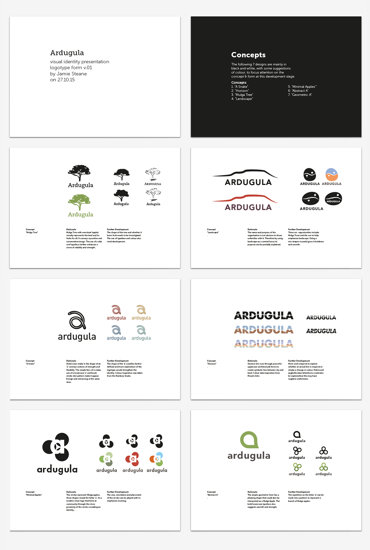
The work featured on this page shows some of the initial concept design work and visual identity work that has been used to create both printed and digital design collateral.

This is an ongoing project...


Visual References – Simpson Desert, Southern Australia
Concept Presentation
Visual Identity Guidelines
Stationery and T Shirt Design

Tools For Everyday Life

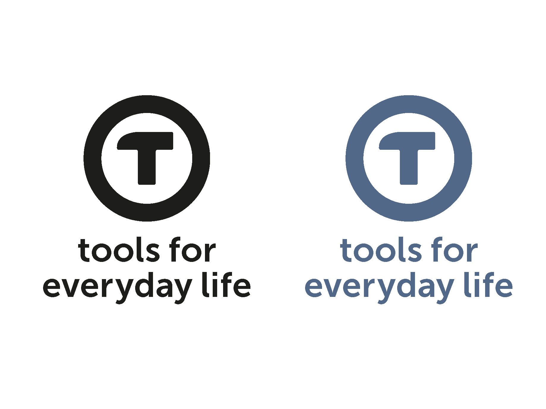
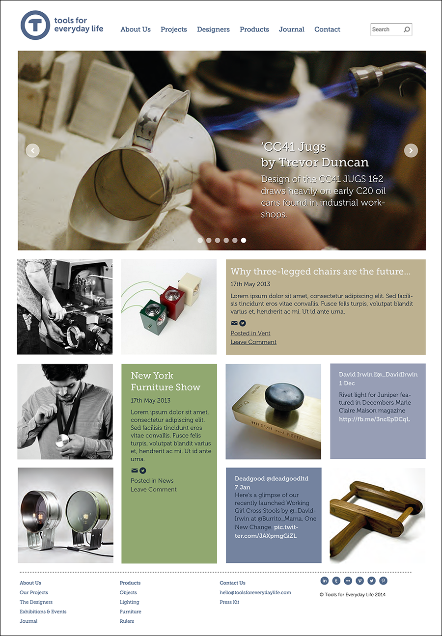
Visual identity and web presence for an on-going research project called ‘Tools For Everyday Life’. The Tools for Everyday Life aims to investigate the role and relevancy of materials and processes knowledge in the design of functional products. The project is run from Northumbria University’s Design Department and draws it’s designers from the community of practice that surrounds BA (Hons) 3D Design and the post graduate Designers in Residence scheme.

My design brief was to create a visual identity and web presence that echoed the distinctive yet utilitarian nature of the project's work - tall order! Key considerations included the design of an adaptive web design for various devices and a CMS system that is easy to use by multiple editors with limited technical experience.


Responsive web design works well on smart phones and tablet devices
tools-logo.png
Stationery elements
Stationery elements
Designers page
Designers page
Homepage
Homepage
Alternative tools logo concepts
Wireframes
Wireframes

Flourish

Flourish – Innovate UK funded project (2014) aimed to investigate the potential of applying models of well being drawn from positive psychology (e.g. PERMA) to long-term care for older people. This collaboration between Northumbria, Oxford and York Universities with creative businesses Digital Laundry and Cedilla Publishing developed a new digital recommendation service for the elderly and a number of academic papers including one accepted for CHI 2015.

My role within the team was to lead and mentor graduate researchers to create ‘design fictions’ about future services. Inspired by Evgeny Morozov's book 'To Save Everything, Click Here: Technology, Solutionism, and the Urge to Fix Problems that Don't Exist'  we devised a board game called 'Solutionism' to help generate ideas for design fictions based on qualitative data from the Flourish study. These ideas were then turned into plausible adverts for future services to help illustrate the initial research findings and incite debate.

board-game-v3.jpg
vintage-volunteers-ad.jpg
social-compass-ad.jpg
pavilion-ad.jpg

Wildblood-Macdonald Branding Workshops

Working with Plump Digital, we ran a series of workshops to help Wildblood-Macdonald Chartered Architects explore their brand to create a value proposition. 

These visual marks are a series of concepts developed from those early workshops and helped the partners form their opinions before deciding on their eventual choice. See http://www.wildblood-macdonald.com for the final results.

wildblood-why.jpg
wildblood-logos.png
wildblood-logo-01.png
wildblood-stationery-01.png
wildblood-logo-no6.png
wildblood-stationery-02.png

Wildblood-Macdonald Website

Wildblood-MacDonald are chartered architects known for the design of sensitive housing schemes, large private houses and children’s hospices. The diversity of their practice meant that a website was essential in order to communicate the breadth of their work to both their current and prospective clients. 

In 2005, I designed their first website after a lengthy consultation process which included a detailed information architecture phase to help future proof their needs. This initial design was so successful that the site was not fully redesigned until the implementation of this second content managed site in 2011!

After the retirement of senior partners from the business in 2013 the site has recently gone through its third redesign 2014 – a process that I began with Plump Digital who now design and maintain their web presence.

wildblood-web-00.png
wildblood-web-03.png
wildblood-web-01.png

Le Coeur De Yorkshire

Inspired by the Tour De France coming to Yorkshire in 2014 this project was more just a branding exercise.

This charity cycle ride around some of Yorkshire's magnificent countryside and historic cities pioneered a new cycle route! 

The route followed a heart shape starting and Leeds and heads out into the Yorkshire Dales before crossing onto the North Yorkshire Moors and ending with a decent into York.

The first trip on this brand new route can be followed on Twitter:  https://twitter.com/lecoeurdeyork 


letour-logo.png
t-shirt-front.jpg
t-shirt-back.jpg

XSEM Visual Identity and Website

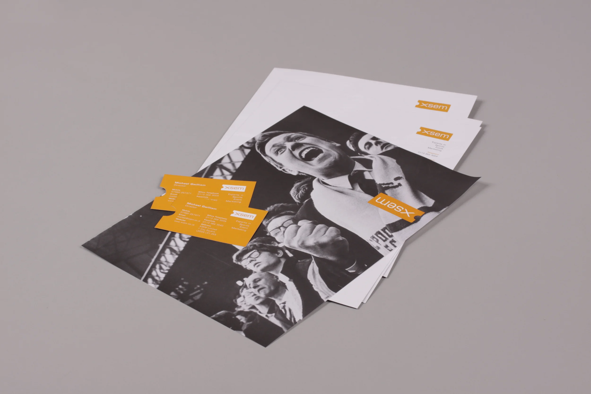
Visual Identity and Website (2005) for XSEM a Leeds-based sports hospitality and marketing company. 

XSEM is an agency borne out of a passion for sport. Taking this cue, the visual identity reflects passion through a strong use of colour and imagery. Nostalgic photos of fans rather than sports stars communicated the experience that XSEM were trying to create for their corporate hospitality customers and neatly got round expensive photographic right issues associated with current sporting events.

The mark used a simple ticket motif to provide a visual clue to XSEM's business activity as their name which was based on an acronym for Executive Sports Event Management would have been be lost on many prospective customers. The ticket motif was carried through to die-cut business cards. 

stationery-03.jpg
xsem-web-01.png
_MG_0334.JPG
stationery-02.jpg

Malaysia Airlines Inflight Entertainment

The design of this innovative audio and video on demand (AVOD) inflight entertainment system was completed back in 1998, whilst I was working for Time-Warner (Emphasis).

The touchscreen and controller-based system also included Nintendo games, shopping and telephony integration as well as bespoke information services for passengers.

These latter information services included the creation of both a Kuala Lumpur-based business and tourist information guide called 'KL Planner' and a 'Timeout' style what's on guide called 'Showtime' for other key destinations including London and New York. Showtime was also available online for passengers access information on reaching their destination.

My responsibility was for the design, management and implementation of UI and creation of the monthly updated content. This ground-breaking project required the careful management of partner relationships with British Telecom, Matsushita and Sony who were the telecommunication, software and hardware suppliers to Malaysia Airlines.

malaysia_airlines01.jpg
malaysia_airlines04.jpg
malaysia_airlines02.jpg
malaysia_airlines03.jpg
malaysia_airlines05.jpg
malaysia_airlines06.jpg

Lotto.ie

In 1999, our highly original and technically innovative digital branding campaign for the Irish National Lottery,  featured the creation of the ‘Fortune Family’ who hosted an online only lottery show. This Adobe Flash-based site won a number of awards including Yahoo’s ‘Site of the Day’.

The characters were initially modelled in 3D before being painstakingly traced in Adobe Flash. Gradient fill colours were used to recreate the 3D effect. This technique preceded 3D to vector conversion tools by some years...

The project was not just technically innovative, it was creatively ambitious too, as it was one of the first websites where online creativity led the user experience rather than aping TV.

Opening title sequence
Fergal Fortune explains the game
lotto06.png
Fionnula Fortune hosts the news and about pages...
Young Fergus provides help...
The Golden Goose lays the golden eggs (lottery numbers)
The family cat looks after the 'scratch card' section

Sade Interactive

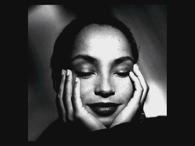
Hybrid CD-ROM/Online project for Soul/R&B artist Sade (1996). This biographic interactive product included a video collection of greatest hits, biography, complete discography, tours and more participative interactions including a quiz and karaoke.

The project was authored using a bespoke video CD authoring kit that we wrote and included the use of a proprietary software decoder to play full-screen mpeg video.

Music interactive projects until this point had focused on creating game like experiences such as Peter Gabriel's 'Xplora 1' (1993) and David Bowie's 'Jump' (1994). Sade Interactive and the authoring kit that created it, was commercial solution to a growing appetite for creating engaging musical interactive products in a quicker and more cost effective timeframe.


packaging-v02.jpg
packaging-v03.jpg
packaging-v04.jpg
biog19t1.jpg
biog19p1.jpg
biog03t1.jpg
biog03p2.jpg
tour06t.jpg
menu.jpg
quiz002.jpg

Video Jukebox

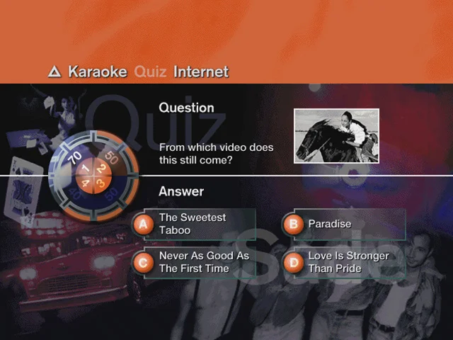
This 1995 interactive 'Video CD' compilation was revolutionary in numerous ways.

Technically this CD-ROM used a proprietary software decoder to play full-screen video, before this time consumers needs a dedicated video card to watch full-screen video. It also incorporated a integrated custom web-browser to add additional live content to the CD-ROM.  

As a product design it helped resolve a long standing issue with video compilations. Previous video compilation on VHS videotape had not sold as well as their audio CD counter parts, mainly due to the inconvenience of having to fast-forward past videos that you did not like. Having a skip feature like an audio CD gave new life to the video compilation format.

To celebrate this revolutionary produce I decided to use a futuristic CD Laser interface to access the CD-ROM's feature. It was an elaborate and playful user-interface metaphor. This ambitious interface design was actually a physical model that we composited the video, text and buttons onto after it was lit and photographed in a studio.

final menu.png
menu02 with sequence.png
final info 03t.png
quiz01.png
internet_intro vj02.png
s_shot_spandau+control.png
title-sequence.png

Project Forest

This ambitious and highly innovative blended learning initiative (1998-1999) received significant European Union 5th Framework funding and was aimed at ‘Inter Certificate’ level children (Junior Cycle Student Award) in the Republic of Ireland.

The focus was to help 15-16 year olds apply their previous learning from individual subjects such as history, geography, maths and biology to deeper topic based learning in order to inform their study choices to the age of 18.  In this case, the topic of the project was forestry in Ireland.

From initial focus group research with school children about there expectations and previous exposure to digital technology we discovered that when it came to blended or e-learning the accepted educational adage of 'play to learn' could be turned on its head as our participants appeared to be prepared to learn anything in order to play! From this research insight we decided to 'gamify' their learning experience by creating 22 forestry themed interactive games, supported significant classroom activities and resources.

This early gamification of educational material was a very novel approach back in 1998. However, at this time in both urban and rural Ireland, we could never be entirely sure of the availability of PCs or internet access in the classroom, so we created printed and digital resources that were accessible both on CD-ROM and online for participating schools.

Branding & Packaging

After initial research with teacher focus groups, it was evident that teachers would feel happiest if interactive content (CD-ROM and online) was supported by extensive printed and printable resources.

CD-ROM Interface
CD-ROM Interface

The project was divided into several topics e.g. 'The Past and Future of Trees'. These were sub-divided into subsections creating 30 weeks of lessons and activities accessible from the CD-ROM menu.

Forest Simulation
Forest Simulation

The most complex game was a forestry simulation allowing children to design, grow and 'harvest' their own forest. The game encouraged them to balance profit with environmental interests displayed as an 'Eco Status'.

Forest Eco System Game

This activity asks children to plant trees in appropriate environments and also manage more random issues such as forest fires.

Virtual Reality Tour

This Quicktime VR tour allowed children to view parts of a tree and then identify them in a multi-player quiz.

prev / next
Back to Design + Research
13
Bigg Ideas
8
Tapestry
Scenario
6
Freeman Hospital
Branding
8
W * * * C H C R A F T !
gden-home-sq.png
3
Graphic Design Educators' Network
julias-story.png
9
Working Carers
Screenshot 2019-07-26 at 08.15.48.png
7
See It All
ardugula-intro-comp.png
5
Ardugula
tools-phonex2.png
7
Tools For Everyday Life
board-game-v3.jpg
4
Flourish
wildblood-logos-no4.png
6
Wildblood-Macdonald Branding Workshops
wildblood-web-01c.png
3
Wildblood-Macdonald Website
letour-logo.png
3
Le Coeur De Yorkshire
stationery-03.jpg
4
XSEM Visual Identity and Website
malaysia_airlines01.jpg
6
Malaysia Airlines Inflight Entertainment
lotto05.png
7
Lotto.ie
packaging-v02.jpg
10
Sade Interactive
final menu.png
7
Video Jukebox
Branding & Packaging
5
Project Forest

Powered by Squarespace